今日は「トーン差をつけないグレーのワントーンカジュアルスタイリング」と言うテーマを掲げて、「Style Book」コンテンツのカジュアル編の記事をお送りしたいと思います。
Today, I would like to write an article with the theme of “Gray one tone casual styling with no difference in color tone.” And in this article, I consider about how to layer textures when there is no difference in color tone.
・TPOと装い/Situation and Attire
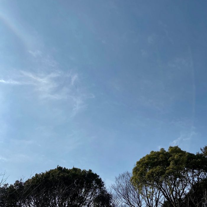
本日取り上げるのは、2020年の2月中旬の週末のカジュアルスタイリングです。この日はよく晴れており、また最高気温が16度程度と高く、日中はコートがいらない暖かさでした。
I’ll introduce a casual styling on the weekend of mid-February 2020. The day was sunny and the maximum temperature was as high as 16 ° C, so it was warm and I didn’t need wearing a coat during the day.
この日はカジュアルレストランでランチを取ることにしていましたので、ジャケットを羽織り、カジュアルながらも大人っぽい雰囲気のスタイルを楽しむことにしました。
I planned to have lunch at a casual restaurant on this day, so I decided to put on my jacket and enjoy a casual but mature style.
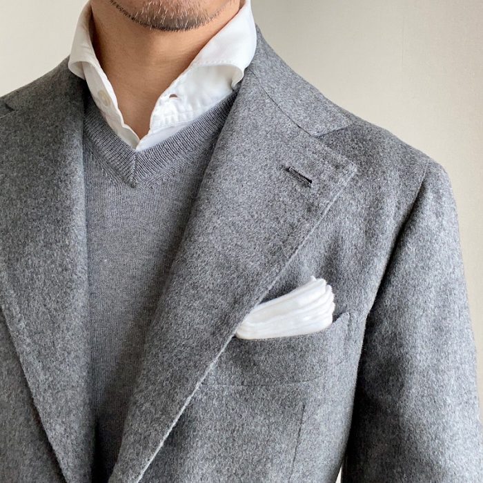
そこで私が着用したのが、グレーのカシミアジャケットにコットンのホワイトシャツ。そしてVネックのハイゲージニットをインナーに入れて、グレーのワントーンスタイリングをしました。
So, I wore a gray cashmere jacket, a gray high-gauge V-neck knit over white cotton shirt, and selected a gray one tone styling.
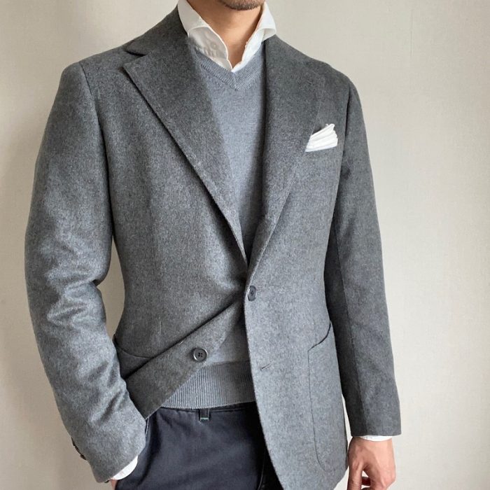
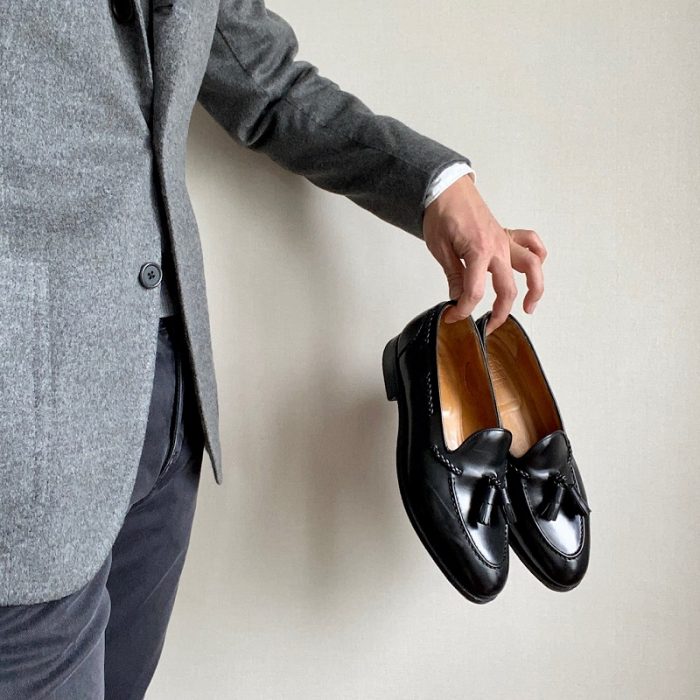
またブラックデニムを穿き、足元にはブラックカラーのタッセルローファーを選びました。
I also wore black denim and chose a black colored tassel loafers for my feet.
・あとがき/ Consideration
先日「トーン差をつけないVゾーンスタイリング」と言う記事において、トーン差をつけないドレススタイルをテーマに取り上げていました。そこではトーンに差をつけないコーディネートをするのであれば、彩度ではなく、明度に差をつけない方法が望ましいのではないかと主張しました。
The other day, in the article titled “The dressed chest with no difference in color tone“, I addressed the theme of dress styles with no difference in tone. I suggested that if you want to coordinate items which are no difference in color tone, it is better to match same lightness items rather than saturation.
この記事では色のトーンではなく、素材感における工夫について考察したいと思います。
In this article, I would like to consider not the color tone, but the ingenuity in the texture.
一般的にグレーのワントーンスタイリングは落ち着いた雰囲気になりますので、カジュアルスタイルであっても大人っぽさを出したい時にはおススメのカラーコーディネートです。
Generally, gray one-tone styling creates a calm atmosphere, so if you want a mature look even in a casual style, that I recommended you that color coordinates.
今期は特にグレーのワントーンスタイリングが気に入っており、この秋冬では様々なかたちで楽しんできました。
I especially like the gray one-tone styling this term, and I enjoyed it in various ways this fall and winter.
このような中で、レイヤードするアイテムの色にトーン差をつけない場合に個人的に気をつけていることが、素材の重ね方です。
Under these circumstances, it is the way of layering the texture that I personally take care when I match items with no difference in color tone.
具体的には、装いにおけるアイテム間の色のトーン差がないことによって視覚的な立体感が失われますので、これを補うために異なる素材感を持つアイテムを合わせるようにしています。
Specifically, since there is no color tone difference between the items in the attire, the visual three-dimensional effect is lost. To compensate for this, I use different textures.
今回の場合で言えば、ジャケットはカシミアなので起毛していますが、インナーに着ているウールのニットはクリアな表情を持つハイゲージニットを合わせています。ここでインナーにも起毛しているカシミアのニットを合わせると視覚的な立体感がより失われるだけではなく、野暮ったい雰囲気が出かねません。
In this case, the jacket is brushed because it is cashmere, but the high gauge wool knit worn on the inner has a clear expression. If you combine the cashmere knit that is also brushed on the inner, not only will the visual three-dimensional effect be lost, but it will be unrefined in appearance.
このように異なる表情を持つ素材どうしを重ねることで、ワントーンの場合に表現することの難しい視覚的な立体感を補完することが出来るのではないかと個人的には考えています。
I personally think that by overlaying materials with different texture in this way, it is possible to complement the visual stereoscopic effect that is difficult to express in one -color-tone.
つまりトーン差のないスタイリングを楽しむ際には、起毛しているものとしていないもの、光沢感があるものとないもの、網目が粗いものと細かいもの、と言う異なる素材感を持つアイテムどうしをレイヤードさせることで、立体感のある美しい装いが出来ると思っています。
In other words, when you enjoy the styling with no difference in color tone, layer items that have different textures, that is, those that are brushed and not, those that are glossy and not, those that have coarse and fine meshes should be layered. By doing so, I think that it is possible to make a beautiful style with a three-dimensional.