今日は「トーン差をつけないVゾーンスタイリング」と言うテーマを掲げて、「Style Book」コンテンツのドレス編の記事をお送りしたいと思います。
Today, I would like to write an article with the theme of “The dressed chest with no difference in color tone”. And in this article, I consider about how to make beautiful the dressed chest with no difference in color tone.
・TPOと装い/Situation and Attire
本日ご紹介するのは、1月下旬の装い。この日は朝からよく晴れており、最高気温が12度くらいと天気の良い1日でした。
Today, I’ll introduce the attire of late January. It was a sunny day, with a maximum temperature of around 12 degrees Celsius.
ところで、季節感が強く表現されている生地と言うのは一般的にはカジュアルに分類されます。よって社外の方との打ち合わせが無い日などは、積極的にそういった生地を用いた装いをファッション好きとして楽しんでいます。
By the way, fabrics with a strong sense of the season are generally classified as casual. Therefore, on days when there is no meeting with people outside the company, I am actively enjoying dressing with such fabrics as a fashion lover.
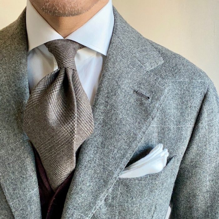
この日はグレーをベースカラーとしたフランネルウールのウィンドウペンスーツに、ホワイトの無地シャツとフランネルウールのベージュのグレンチェックタイ。そして、ブラウンカラーのウールのカーディガンをインナーに合わせ、胸にはホワイトのポケットスクエア(コットン)を入れています。
In this situation, I chose a flannel wool window-pain check suit with a gray base color, a plain white shirt and a flannel wool beige glen check patterned tie. Also I combined brown wool cardigan to inner, and white pocket square (flannel cotton) is put on the chest.
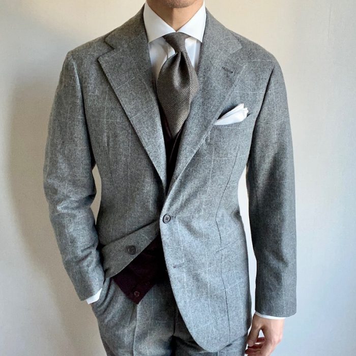
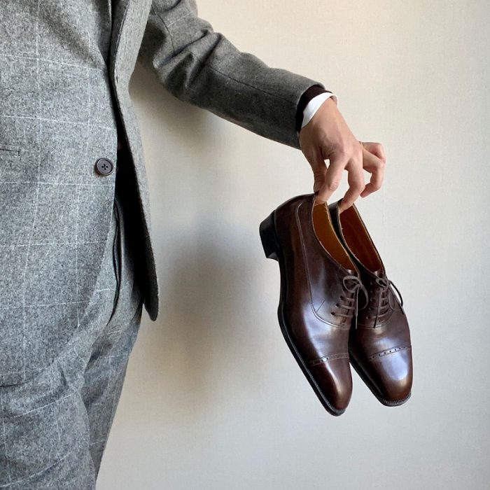
そして足元にはブラウンカラーのストレートチップを選びました。
And I wore brown semi-brogue shoes for my feet.
・あとがき/ Consideration
色にはトーンが存在します。トーンの定義を引用すると、下記のような説明になります。
Color has a tone. To quote the definition of a tone, the description is as follows:
明度と彩度の複合概念/Complex concept of lightness and saturation
引用/Quote:日本色研事業株式会社のHPより
下記の図が分かりやすいので、合わせて引用します。縦軸に明度、横軸に彩度をおいて、トーンをイメージ化したものになります。
The following figure is easy to understand, so I will quote it together. The lightness is plotted on the vertical axis and the saturation is plotted on the horizontal axis.
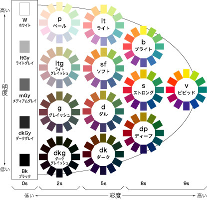
引用/Quote:日本色研事業株式会社のHPより
色と言う観点でみた場合、一般的に服をコーディネートする際にはトーンの異なるアイテムどうしを合わせることが多いように感じています。
In terms of color, I generally feel that when coordinating clothes, items with different tones are often combined.
例えば、ダークネイビーのジャケットに合わせるのは、チャコールグレーやネイビーのような明度が同じような暗い色ではなく、ライトグレーのような明るい色のパンツが多くなります。
For example, dark navy jackets are often fitted with light-colored pants, such as light gray, rather than dark colors with similar lightness, such as charcoal gray or navy.
また、Vゾーンの場合も同様に、スーツやジャケットに暗い(落ち着いた)彩度の色のものを着ている場合、ネクタイは華やかな色合いのものを選ぶと言うコーディネートが一般的に浸透しているように思います。
Also, in the case of the dressed chest, when you wear dark (calm) colors suits or jackets, the coordination of choosing gorgeous colors tie seems to be in common use.
なぜ色のトーン(明度・彩度)の異なるアイテムを合わせるのかと言うと、個人的には立体感が出て、美しくなるからだと理解しています。もちろんこれは私個人の考えなので、異なる解釈をされる方もいるでしょう。
I personally understand that matching items with different colors (brightness / saturation) gives a three-dimensional effect and beauty to the attire. Of course, this is my personal opinion, so some may have it differently.
しかし、ビジネスでは華やかなアイテムどうしを重ねることは難しい場合が多いですし、同じ明度を持つどうしを合わせると、どうしてものっぺりとして、メリハリがない印象になってしまったり、装いとしての表情が乏しくなってしまったりすることが多いと私は感じていました。
However, it is often difficult to overlap gorgeous items in business attire, and if you combine items with the same lightness, I was feeling the attire will not have a sharp impression, or less expression as fashion.
ただ、実際に自分でチャレンジしてみないと感覚は分からないので、最近は同じようなトーンのアイテムをコーディネートしてみることが多くなってきました。
But, since I can not understand the sense unless I actually try it myself, recently I’m often trying to coordinate items with similar color tone.
本日取り上げている装いも、そんなチャレンジのうちの1例です。
The attire I’m talking about today is one example of such a challenge. A bright tone suit and tie were combined to coordinate the dressed chest.
スーツ、ネクタイともに明るい色(明度)を用いる場合に気をつけたいことが、落ち着かない印象を与えてしまう、浮つき感です。私はこれを抑えるために、この日はダークブラウンのカーディガンをインナーに合わせました。
When using bright colors (lightness) for both suit and tie, one thing to be careful about is to give a restless impression. To keep this in check, I adjusted my dark brown cardigan to the inner this time.
それが効果を発揮したのか否かは分かりませんが、思ったよりも落ち着かい印象は強くならなかったように個人的には感じています。
I don’t know if it worked or not, but I personally had a feeling better than I expected.
ビジネスシーンでは彩度が高い、ビビッドな色同士を合わせることは難しいように思いますので、トーンに差をつけないコーディネートをするのであれば、彩度ではなく、明度に差をつけない方法が望ましいと思っています。明るいトーンを上手く合わせるコーディネートすることが出来れば上品な雰囲気を、暗いトーンを合わせると落ち着いた大人っぽい雰囲気を醸し出せると感じています。
It seems difficult to match with high saturation (vivid) items each other in the business attire. So if you want to coordinate items which are no difference in color tone, it is better to match same lightness items. I feel that if I can coordinate well with bright tones items, I can create an elegant atmosphere, and also if I coordinate with dark tones items, I can create a calm and mature atmosphere.
まだまだ私も経験が足りませんが、今後もチャレンジを重ねることで、トーンに差がないアイテムを合わせることで美しく装うための秘訣を探ってみたいと思います。
I don’t have enough experience yet, but in the future I will try to find out the secret of dressing beautifully by matching items with the same color tone.