本記事では「メンズドレススタイルにおける色の使い方」と言うテーマの中でも、特に装いに使う色の合わせ方について記述したいと思います。
In this article, I would like to describe the color combination in the theme “How to use color in gentlemen’s dress style”.
これまで「メンズドレススタイルにおける色の使い方」と言うテーマをもとに、私自身の「ベースカラー」及び「使う色の数」に対する考え方について触れて来たのですが、最後は「色の合わせ方」に対する考え方をご紹介したいと思います。
So far, I have explained my own concept of “the base colors” and “the number of colors used” based on the theme of “How to use colors in gentlemen’s dress styles”. I want to introduce the concept of “How to combine colors”.
まず結論から記述したいと思います。細かいことを除きますと、大切にしている基本的な要素は1つだけです。それは、
First, I would like to write from the conclusion. Except for the details, only one basic element is important. That is,
・装い全体の色をなじませる/ Harmonize the colors of the whole attire
と言うことです。バランスを取ると表現しても良いと思うのですが、その「全体の色をなじませる」・「バランスを取る」際に重要なのが、“色のグルーピング”と言う考え方です。
Also I can say that it as a balance between the colors of whole attire. And when you “harmonize the overall color” or “balancing color” in the attire, the concept of “color grouping” will be the key point.
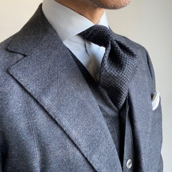
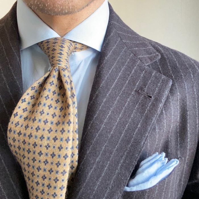
“色のグルーピング”と言う考え方を端的表現すると「色そのものやトーンが近い色どうしを合わせること」と言えます。色をアカデミックに捉えるのであれば何かしらの理論もあると思うのですが、あまり難しいことを考えず、自分が近いしいと感じる色同士を合わせることがポイントです。
A simple way to express the idea of ”color grouping” is to “match colors that have similar colors or tones. I think there are some theories if we think of colors as academic, but the point is combining colors that we feel are close, without thinking too deep.
その“色のグルーピング”において基本となるのが、いわゆるグラデーションです。実際、私も普段のドレススタイルではかなり多用している色の使い方だと思います。
The basic of the color grouping is the so-called gradation. In fact, I use the gradation of color quite a lot in my usual dress style.
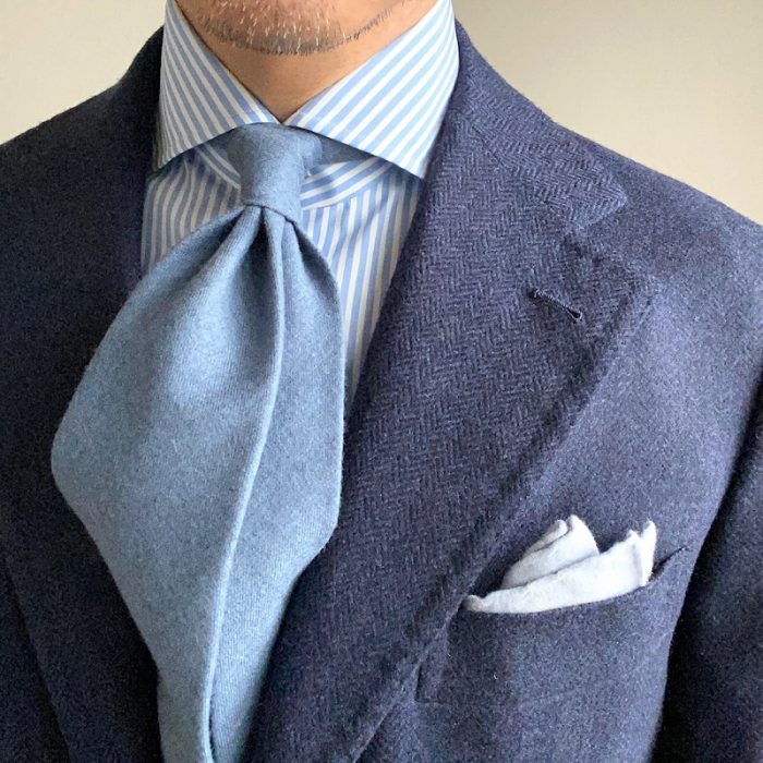
また「どんな色どうしが近しいのか」と言うのは理論よりも感性によるところが大きいと思いますので、ここではあまり言及しませんが、「寒色」「暖色」「中間色」と言う分け方は1つの参考になるのかもしれません。
Also, I think that what kind of colors are close to each other depends more on sensitivity than theory, so I will not mention much here, but grouping color according to “cold color”, “warm color” and “neutral color” is might be one reference.
メンズのドレススタイルでは必然的に用いるアイテムが大よそ決まってきます。そして「ベースカラー」の記事で述べたように、ベースカラーで使う色を4色と限定すると、シャツやネクタイ、ポケットスクエアにジレやニット、ホーズ、そして靴など“色で遊べる”アイテムは当然制限されてきます。
In the gentlemen’s dress style, the items used to attire inevitably are largely determined. And as mentioned in the article on “about the base color”, if you limit the number of colors used in the base color to 4 colors, items that can be played with colors, such as shirts, ties, pocket squares, gilets, knits, hoses, and shoes, are naturally limited.
しかし逆に言えば、様々な制約があるからこそ、そこに着用者の美意識が如実にあらわれると思いますので、そういった点にファッションの楽しさ、奥深さを感じています。
However, to put it the other way around, I think that the aesthetic sense of the wearer will come out clearly because of various restrictions, and I feel the fun and depth of fashion in that respect.
上述の通り、私は自らの置かれた環境や感性を踏まえると、美しい装いをするにあたって重要な色の合わせ方のポイントは、装い全体の色をなじませることだと考えています。是非、参考にされてみてください。
As mentioned above, I think that the key point of color combination that is important in beautiful dressing is to harmonize the color of the whole dressing, taking into account the environment and sensibilities of myself. By all means, please try to reference.